Simulating Sampling
The different random number functions in R make it easy to simulate drawing a sample from a very large population. For example, let us suppose that 17% of a large population has high cholesterol. We would like to similate taking a sample from this population and counting the number with high cholesterol. The rbinom() function can simulate such a process by generating random numbers from a binomial distribution.
> rbinom( 1, 100, 0.17 )
[1] 19
Dividing by 100 (the size of the sample) would give us a value of p-hat, the sample proportion, i.e. the proportion of our sample that has high cholesterol.
Recall that a random variable is a numerical measure that comes as the result of a probability experiment. If we are particularly interested in the probability experiment of choosing a random sample of 100 people and finding the proportion with high cholesterol, then this defines a random variable. The probability distribution of this random variable is called the sampling distribution of the mean.
One outcome of this random variable would be simulated by
> rbinom( 1, 100, 0.17 ) / 100
[1] 0.16
Simulating the sampling distribution of the proportion
We can get an idea of the shape of a sampling distribution by computing lots of values for it and then creating a histogram. For example, we might compute 1000 sample proportions and then look at the histogram to see how the different p-hats are distributed.
Conveniently, the first argument of rbinom() indicates how many times you want to run the experiment. So we can easily compute 1000 values of p-hat and store them in the array a:
> a = rbinom( 1000, 100, 0.17 ) / 100Then drawing a histogram of the array, we see approximately what the sampling distribution looks like.
> hist(a, freq=FALSE);
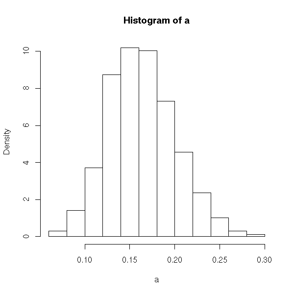
It isn’t perfect, but the sampling distribution appears to be approximately normal, and it has its center near 0.17, the same as proportion of the population that actually have high cholesterol.
Putting it together
It would be nice to be able to do the steps above for different sample sizes. Do the proportions of samples of size 2 have a different distribution than proportions of samples of size 5 or 100 or 1000? To conveniently repeat the steps above, we can put them together into a function. Then we can call the function as often as we want with the sample sizes that we are most interested in.
> sampling_prop = function( n, p ) {
 a = rbinom( 1000, n, p ) / n;
 hist( a, freq=FALSE );
}
> sampling_prop(1,.17)
...
> sampling_prop(2,.17)
...
> sampling_prop(5,.17)
...
> sampling_prop(100,.17)
...
> sampling_prop(1000,.17)
Notice that for higher sample sizes, the distribution looks very normal and "tall but narrow" (i.e. has low standard deviation).
Checking against the theorem
According to our book, the central limit theorem states that the sampling distribution of the proportion will be approximately normal when n(p)(1-p)>=10. It will have its center (i.e. mean) at the population proportion, and its standard deviation will be sqrt((p)(1-p)/n) where n is the size of the samples. To see that our histograms are consistent with the theorem, we could add one more line to our function; we’ll add a graph of the normal curve from the theorem.
Minor note: we’ve also made a small change to the histogram, specifying a uniform set of break points. This helps the output be consistent and look better.
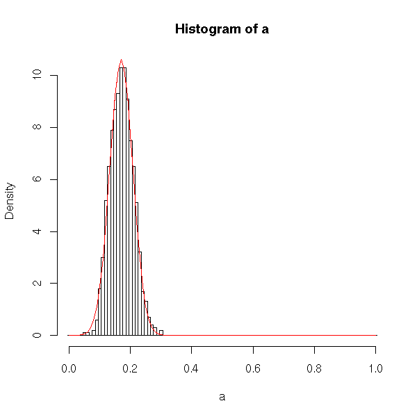
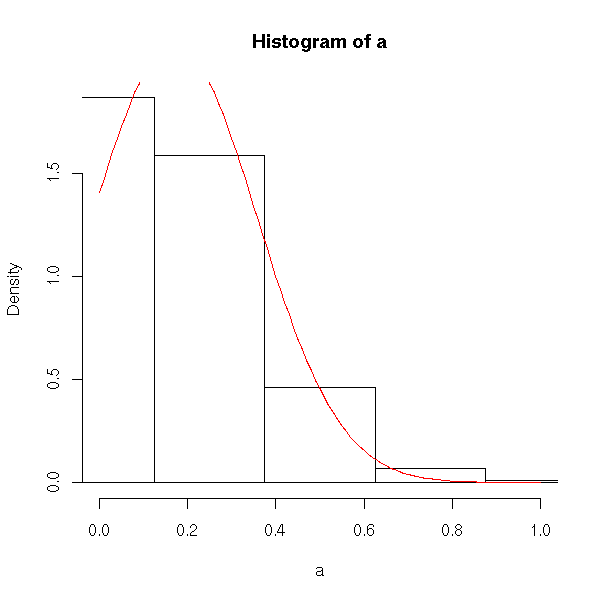
> sampling_prop2 = function( n, p ) {
 a = rbinom( 1000, n, p) / n;
 hist( a, freq=FALSE, xlim=range(-.5,n+.5)/n, breaks=(-.5:(n+.5))/n );
 curve( dnorm(x, mean=p, sd=sqrt(p*(1-p)/n)), add=TRUE, col="red" );
}
Now, we can easily see that samples of size 4 give a sampling distribution that doesn’t look very normal (doesn’t really look like the red curve).
Samples of size 100, a large sample, give a sampling distribution that looks quite normal (and very similar to the red curve suggested by the theorem).