Simulating Sampling
The different random number functions in R make it easy to simulate drawing a sample from a very large population. For example, let us suppose drawing a sample of 5 test scores from a very large population of students. Assume we know the scores are normally distributed with a mean of 70 and a standard deviation of 10. The rnorm() function can simulate such a sample by generating 5 random numbers from a distribution with those parameters.
> rnorm( 5, mean=70, sd=10 )
[1] 74.80979 76.26670 81.08698 61.04122 80.36462
Recall that a random variable is a numerical measure that comes as the result of a probability experiment. If we are particularly interested in the probability experiment of choosing a random sample of 5 test scores and computing their mean, then this defines a random variable. The probability distribution of this random variable is called the sampling distribution of the mean.
To simulate one outcome of the random variable, we can use the rnorm() function to simulate a sample, then compute the mean of those 5 scores, as in:
> mean( rnorm( 5, mean=70, sd=10))
[1] 65.82057
Simulating the sampling distribution of the mean
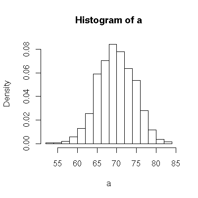
We can get an idea of the shape of a sampling distribution by computing lots of values for it and then creating a histogram. For example, we might compute 1000 means of samples and then look at the histogram to see how these means are distributed.
The replicate() function makes it easy to compute 1000 sample means.
> a = replicate( 1000, mean( rnorm( 5, mean=70, sd=10 )))Then draw a histogram of the array to see approximately what the sampling distribution loks like.
> hist(a, freq=FALSE);
It might be nice to compare this histogram with the parent distribution to see if it looks similar or different.
curve( dnorm(x, mean=70, sd=10 ), add=TRUE, col="red" );
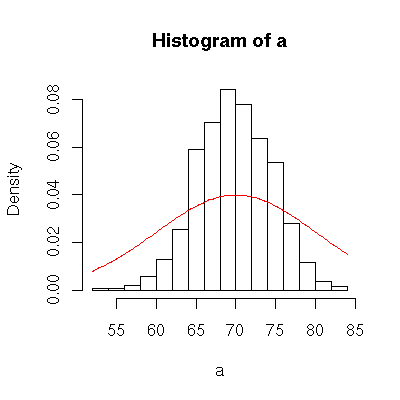
As we can see, the sampling distribution appears to be normal, and it has the same center as the parent. But it is taller and narrower, i.e. it has a lower standard deviation.
Putting it together
It would be nice to be able to do the steps above for different sample sizes. Do the means of samples of size 2 have a different distribution than means of samples of size 5 or 10 or 30? To conveniently repeat the steps above, we can put them together into a function. Then we can call the function as often as we want with the sample sizes that we are most interested in.
> sampling_norm = function( n ) {
 a = replicate( 1000, mean( rnorm( n, mean=70, sd=10 )));
 hist( a, freq=FALSE, xlim=range(40,100), ylim=range(0,0.4) );
 curve( dnorm(x, mean=70, sd=10 ), add=TRUE, col="red" );
}
> sampling_norm(1)
...
> sampling_norm(2)
...
> sampling_norm(5)
...
> sampling_norm(30)
Checking against the theorem
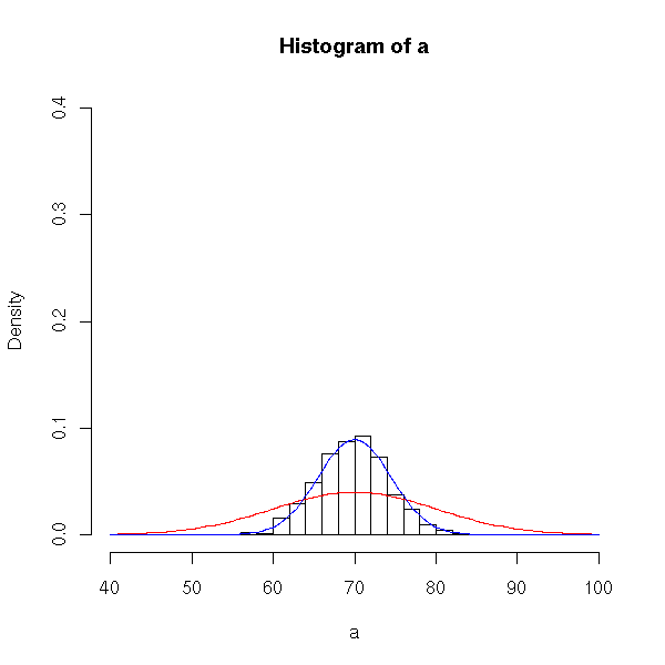
According to our book, the sampling distribution of the mean, when drawn from a normal parent population, will also be normal. It will have the same center (i.e. mean) as the parent population, but its standard deviation will be sigma/sqrt(n) where n is the size of the samples. To see that our histograms are consistent with the theorem, we could add one more line to our function; we’ll add the normal curve from the theorem.
> sampling_norm2 = function( n ) {
 a = replicate( 1000, mean( rnorm( n, mean=70, sd=10 )));
 hist( a, freq=FALSE, xlim=range(40,100), ylim=range(0,0.4) );
 curve( dnorm(x, mean=70, sd=10 ), add=TRUE, col="red" );
 curve( dnorm(x, mean=70, sd=10/sqrt(n) ), add=TRUE, col="blue" );
}
> sampling_norm2(5)
Starting all over again with a different parent population
The central limit theorem is particularly interesting for parent distributions that are not normal. R contains random number generators for many different distributions, including the uniform distribution runif(), the exponential distribution rexp(), the Chi-squared distribution rchisq(), and others. Simulating the mean of sample works analogously to the discussion above, substituting a different random number generator.
For example, a random sample of size 5 from a large population with an exponential distribution with error rate 0.1 might look like:
> rexp( 5, rate=0.1 )
[1]  3.694684  4.664264  4.691242 11.989021 18.675657
The mean of a sample of size 5 might look like:
> mean( rexp(5, rate=0.1))
[1] 8.394714
The CLT for an exponential parent population
As in the previous discussion, it is especially nice to be able to nice to try samples of lots of different sizes and look at histograms approximating each sampling distribution. Here is an analagous version of sampling_norm2() written for a parent with an exponential distribution.
> sampling_exp2 = function( n ) {
a = replicate( 1000, mean( rexp( n, rate=0.1 )));
hist( a, freq=FALSE, xlim=range(0,40), ylim=range(0,0.3) );
curve( dexp(x, rate=0.1 ), add=TRUE, col="red" );
curve( dnorm(x, mean=10, sd=10/sqrt(n) ), add=TRUE, col="blue" );
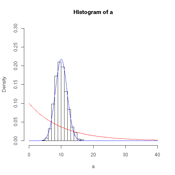
}Try first with samples of size 2, and notice that the sampling distribution does not look like a normal curve (in particular, it does not look like the blue curve).
> sampling_exp2(2)
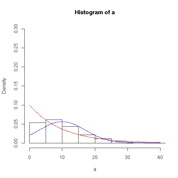
As the samples get larger, the histogram looks more and more normal….
> sampling_exp2(5)
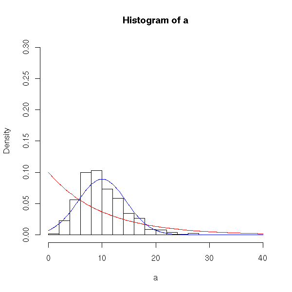
And for large samples (size 30 or greater) the histogram looks very normal and approximates the blue curve well. This is in accord with the central limit theorem, which tells us that for large sampling sizes, the sampling distribution will be approximately normal. It will have the same mean as the parent population, and standard deviation sigma/sqrt(n).
> sampling_exp2(30)